
The following is an excerpt from my Brooklyn Public Library lecture... although I don't think I actually got to it. I've also added to it since.
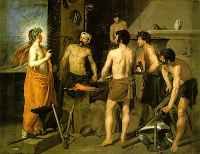
There’s a maxim about lighting and detail that I’ve heard from a number of illustrators, making its source difficult to pin down. It suggests that detail in a painting should be limited to one of two regions: light or dark. Velazquez is the first painter that comes to my mind when I think of this principle. His shadows recede into the background, existing only to give light some competition. Of particular interest in the above painting, The Forge of Vulcan, are the shaded areas on the figures. Where light interacts with the figures, form is illuminated. Where light does not, form (or detail) is lost.
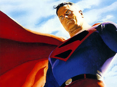
On the other hand, Alex Ross is a great example of a painter who likes to keep us in the dark, so to speak. He often places his figures in blinding light that prevents us from peering into anything but shadow. The effect is dramatic. However, I believe it’s also one of the reasons he’s sometimes criticized for being too photographic. That blown-out effect is a phenomenon that is (I think) subconsciously associated with photography. I’m quite certain that Velazquez never saw anything that looked like an overexposed photo.

Finally, here is an example of my own work for which this principle applies (Mythos: X-Men page 3, panel 1). The effect is always most pronounced in spotlit situations, such as this. With no incident light to reveal form, objects in shadow are only seen when light from behind traces their silhouette.
I'm trying to understand this better. So, for example, in your painting, the man's sweater is simplified with almost no detail at all, only broken color and a slight suggestion of form. His pants, in direct light, shows more texture and detail, creating juxtaposition and variety. Same with Magneto and his cape, right? If you were to put the same amount of detail in both the shadows and lighted areas, the piece would go flat, having no depth?
ReplyDeleteYes, I should have opened with a disclaimer. First of all, this is not a hard and fast rule; it's more of a guideline to keep in mind while composing. Second of all, this only applies if your goal is to make things look "naturalistic." When you look at objects, your eyes adjust to the amount of light available, which allows you to view any part of a real-world composition. But when you have a static image, things usually look "better" if you isolate detail to one area.
ReplyDeleteI say "better" in quotes because the alternative is not inferior, it's just an approach with different goals. But one of the advantages is that it tends to unify a composition, making it easier to read. It is also easier to paint since you (often) are dealing with limited light sources.
Painting from life is much easier than having to invent a believable situation, but this guideline can help simplify that process.
Hope that helps, but perhaps I'll explore this more in a future post.
Thanks for taking the time to reply. This is really helpful and informative. I'm going to give this concept a try :)
ReplyDeleteYou should also check out Mead Schaeffer:
ReplyDeletehttp://goldenagecomicbookstories.blogspot.com/2009/01/mead-schaeffer-1898-1980-count-of-monte.html
Thanks for the knowledge
ReplyDeleteThat's a beautiful panel, Paolo. Great bit of advice here, very informative, loving it.
ReplyDeleteNICE!!! Some of those shapes are so simple but really read. And then he looses edges here and there which kind of make the air look heavy and mysterious, especially with the colorations he is putting in there. That's awesome!
ReplyDelete