 |
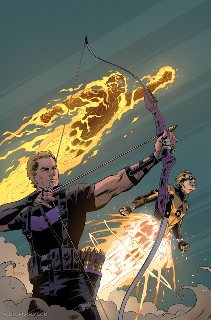
Avengers #5 Variant Cover. 2012.
Ink(ed by Joe Rivera) on Marvel board, 11 × 17.25″.
|
Avengers #5 is out today, and I did a variant cover. You can see a preview
here. I haven't drawn Hawkeye much in my career, but I enjoyed this attempt. Bows are always a challenge for me because so many things have to line up, geometrically speaking. Top that with sticklers for proper form (like myself) and I had my work cut out.
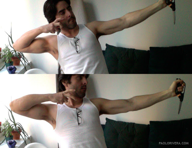 |
| My trusty scissors! |
After searching for images of
olympic archers and
modern recurve bows, I began posing in order to get a "feel" for the correct form. These photos are taken with Photo Booth on my (immobile) iMac, so I had to lean back a bit to get a slightly lower perspective. Originally, I was going to depict him post-release, but I wanted to show the bow line digging into his lip. The effect is tough to convey from this angle (and without fully rendering light and shadow) but I did my best. These photos were more for proportional reference — the final perspective is from a different angle.
 |
| Kiss the string! |
 |
| Inks by my Pops |
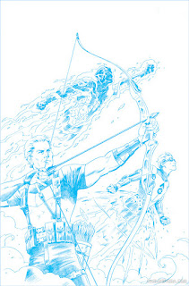 |
| Blue-line print that he inks over |
 |
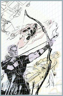
| Pencils (with increased contrast) |
 |
| Digital composite |
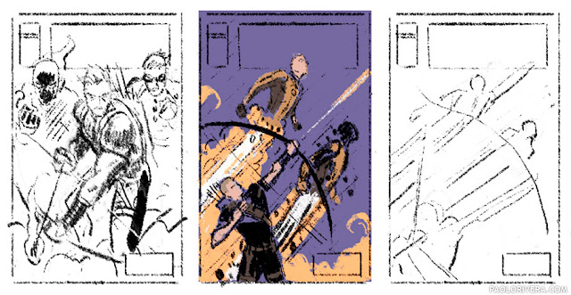
I toyed with the idea of including the Avengers' Quinjet, but I saved myself the trouble and left it out. It's certainly more graphic without it. You can see the Marvel-provided 3D model in the digital composite.
 |
| Almost had a flaming arrow |


When are you going to write a post about your dad?
ReplyDeleteWhen he shapes up and turns in his pages on time! (Kidding.) I've written about him several times before, but perhaps I should highlight his day job some time — he paints motorcycles for a living most of the time.
DeleteOkay firstly, it's a shame you aren't doing the interiors as well because I don't know what the hell happened to Adam Kubert but once upon a time he used to be talented.
ReplyDeleteSecondly, with that digital composite, do you do each character separately and then put them together in the final composite or how does it work. When I try doing group shots it always ends badly but when I do them separately they look like they were cut out and pasted together.
In general, I like to keep each character on a separate layer in the digital composite stage. You can see in the image above that each is a different color, Hawkeye is purple, etc. This helps me keep things organized, especially for covers with even more figures. I've been meaning to do a post on exactly that, so hopefully I'll get to it this year.
Delete