 |
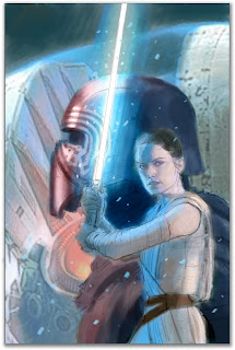
STAR WARS: THE FORCE AWAKENS ADAPTATION #6 Cover.
2016. Gouache & Acryla Gouache on paper, 11 × 17″. |
This cover came out
last month, but I'm only now getting a chance to post. (There's also a
variant version that's a work-in-progress, pictured below). The trick with portraiture of any kind is to have good reference. For this piece, that meant screenshots I took of
The Force Awakens as well as products and promo images I found online.
I like screenshots both because I have control over the exact gesture or expression and because it keep me from using the same photo that everyone else is using. The downside? The quality is never as good as a film still. But if the composition and lighting is strong, details can be bolstered through additional reference.
 |
| Screen shots and "moichendise" |
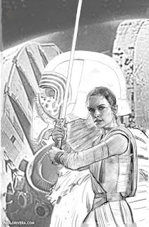
The background is just a pic I swiped from the official poster, then repainted. I wouldn't recommend that in general, but I figure it's okay if the client is the same one that made said poster. Soon, Disney will own everything anyway, so this will no longer a be a problem no matter the property.
 |
| I cheated on the background! |
In order to speed things up, I tried doing a more detailed gouache underpainting in black (like Alex Ross typically does). Of course, whenever I try new techniques to speed up the process, it usually takes longer. Still, it's a good strategy with portraits on a deadline — it's always easier to lock in features before worrying about color.
 |
| digital color study |
 |
| digital pencils |
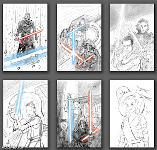 |
| digital layouts |
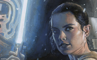 |
| raw scan detail |


When you started applying the color over the black gouache did that start fouling up the colors? I've been reluctant to try this technique because of that possibility.
ReplyDeleteNice finish.
=s=
Thanks! Typically, I do a sepia underpainting, which gives a warmer undertone. For this, I wasn't worried as much because of the blue light. However, if I were to try it again I'd use mostly sepia, but with black or payne's gray for the darker values — basically a 2-color approach.
DeleteCurrently, I'm going straight to color because it gets me more engaged earlier on. But for portraits, a solid drawing or underpainting is essential.